Sunday, 29 March 2015

Extra Critique with friends

Week Five

29.3.15

A group of us from our studio got together for a group critique before class on Monday. I got some good feedback on my spreads for little things.
On my night market spread I am going to add a hand holding a takeaway box of some description to one of the people walking for more of a sense of the market.
The outdoor movie spread is still having issues with a bit too much awkward white space. So I am going to flip the image at the top and move the text onto the left side of the margin so the popcorn can cross over the margin and fill some of the negative space.

I also came up with more cover ideas and I have one Im happy with.
I changed the title to 'A Capital of Culture' and I introduced the leg imagery from the spreads.


Test Print

Week Five

29.3.15

I went to a few different printers around the city, but Ink on Marion has proved to be the best option. It is the cheapest, plus its open on the weekends and its especially student friendly. I got a test print and all the colours came out superbly.

Friday, 27 March 2015

Cover Design

Week Five

27.3.15

I have been experimenting with cover layouts, but at the moment I'm really not feeling it. The concepts I have don't feel connected to the rest of the brochure and the Wellington atmosphere/also aren't very inviting. I have a football tournament over the weekend, so I can just step away from the brochure and come back to it Sunday afternoon with fresh eyes.


Thursday, 26 March 2015

Extra Spread

Week Five

26.3.15

I began creating my extra spreads today. I am going to use Ekim Burger as a dinner place, Kaffee Eis on Cuba St for dessert and Macs Brewbar for drinks. I just sketched out a few ideas as thumbnails and then used my tablet to paint up the main item you would buy from the eatery. I want to create a similar layout to the rest of my spread. The main imagery used on this spread, will be carried into the map.


Tuesday, 24 March 2015

Tuesdays Development & Critique


Week Five

24.3.15

After yesterdays critique I developed all my layouts, and then got some more feedback from Adrian and Karl. The spreads are now looking a lot more cohesive.
I need to change the text layout so it is consistent in style across the spreads. I also need to create small icons for the Salsa spread and the movie spread similar to the noodles in the night market spread. 
I got good feedback about the development of my map, however it was recommended that I add a couple of landmarks to help read the map. 
I still need to create my extra spread, so I was thinking of recommending locations to eat and drink before/after the activity, so I could add those locations onto the map as landmarks.


Monday, 23 March 2015

Map Review

Week Five

23.3.15

After todays lecture/class critique I have reviewed the map situation. I took away unnecessary information. I only have the main roads needed to travel between the destinations and the main landmark of the Cuba fountain. I used small icons to represent each location-not happy with the salsa icon, still need to think of something new.


Class Critique

Week Five

23.3.15

After the class critique today I have a lot to do but it was very good feedback. The salsa spread used to be the strongest but it is now the weakest because the others now show a better sense of the destination.
Areas that are problematic:
I have to make the salsa spread more dynamic with more movement-using depth and scale.
On the outdoor movie spread, I need to show more age diversity.
The night market needs more subtle clues to the food-could have food scraps on the ground.
I need to try incorporate the imagery and the text more-like I did subtly in the market spread.
I need to scale down the key-it is some of the least important information.
The map needs to tie in more with the spreads-I am going to try take away more streets and only have the necessary information. 
Basically all the type needs fixing with more structure. The titles need to be left justified-the centred text feels like an invitation.


The critique also helped as we got to see everyone elses and give them feedback. I got some ideas on how to layout my type with the imagery.

Sunday, 22 March 2015

Map Making

Week Four

21.3.15-22.3.15

For my map I wanted to make it using vectors. I only labelled the main streets relating to the locations as well as couple of extras to help with bearings. Because my key uses the distance from the bcket fountain, I created a picture of that and placed it on the map, I also place a boat in the water to represent the harbour. I just used 3 pinpoints to show each location.

Developing Spreads

Week Four

20.3.15-22.3.15

Over the weekend I have been playing with layouts with the new images and body text. I also started to develop the key to be used. At the moment I am struggling with the layout of the body text. I also need more of a sense of food in the night market.


Friday, 20 March 2015

Creating New Imagery

Week Four

19.3.15-20.3.15

After the last class feedback, I have spent the last couple of days painting up legs for the night market and the outdoor movie. For the market I have used people mid-walk, and also couple in a romantic moment. For the outdoor movie, I have legs showing people in a relaxed setting-chilling on beanbags, casual shoes or barefeet.
Hopefully this will convey the feel of each location whilst keeping it anonymous so the viewer can place themselves within the image/setting.


Wednesday, 18 March 2015

Continued Development and Feedback

Week Four

17.3.15

After the critique yesterday I have tried putting the line around the salsa legs to show movement-and I think it shows more movement and makes it more dynamic.
I was a little stuck on where to go next but after talking to the class, I am going to try convey the feel of each location using just legs and feet: cuba market-lots of people walking, busy and chaotic & the movie night-people sitting on bean bags relaxing.


Sunday, 15 March 2015

Class Feedback

Week Four

16.3.15

In small groups of four we critiqued everyones spreads far. The feedback I got was that the Salsa one was the strongest as the people stayed anonymous whilst still creating a feeling of rhythm and movement from the feet. Still needs development but I also now need to bring this direction into the other activities. The movie night spreads were too literal, especially with the film. The loose curvy line links to the feeling of the destination but doesnt need to be film. Also need to change imagery to make it more anonymous without faces. The cuba st market needs work. I need to show the idea that the market is not just about food, its about going and having dinner with friends for the catch-up and also the sense of community within the market.

Spread Developments

Week Three

14.3.15-15.3.15

Spent the weekend making a few extra pics as well as putting some concepts together for the spreads. Struggled with the cuba st spreads and creating the right atmosphere through the imagery. My flatmates said they got a good urban street feel from the Salsa spreads and the movie night one felt more chilled out, so its good to know they got that vibe from the imagery.

Friday, 13 March 2015

Digital Painting

Week Three

13.3.15

Spent the whole day collating my photos and turning them into a pop art style on photoshop, once I had the tones I wanted I imported them into illustrator and turned them into vector files so I could have more control over the colouring and also so I wouldn't lose quality.
Now I have some more images, I also came up with some more spread ideas.

Tuesday, 10 March 2015

Class Critique

Week Three

10.3.15

Today we had to present our work so far to the class. I didnt have any spreads but I had examples of the imagery I chose. Because I didnt have much to show, I didnt get much feedback but the general consensus from the class was that they liked the idea.

Notes from critique:


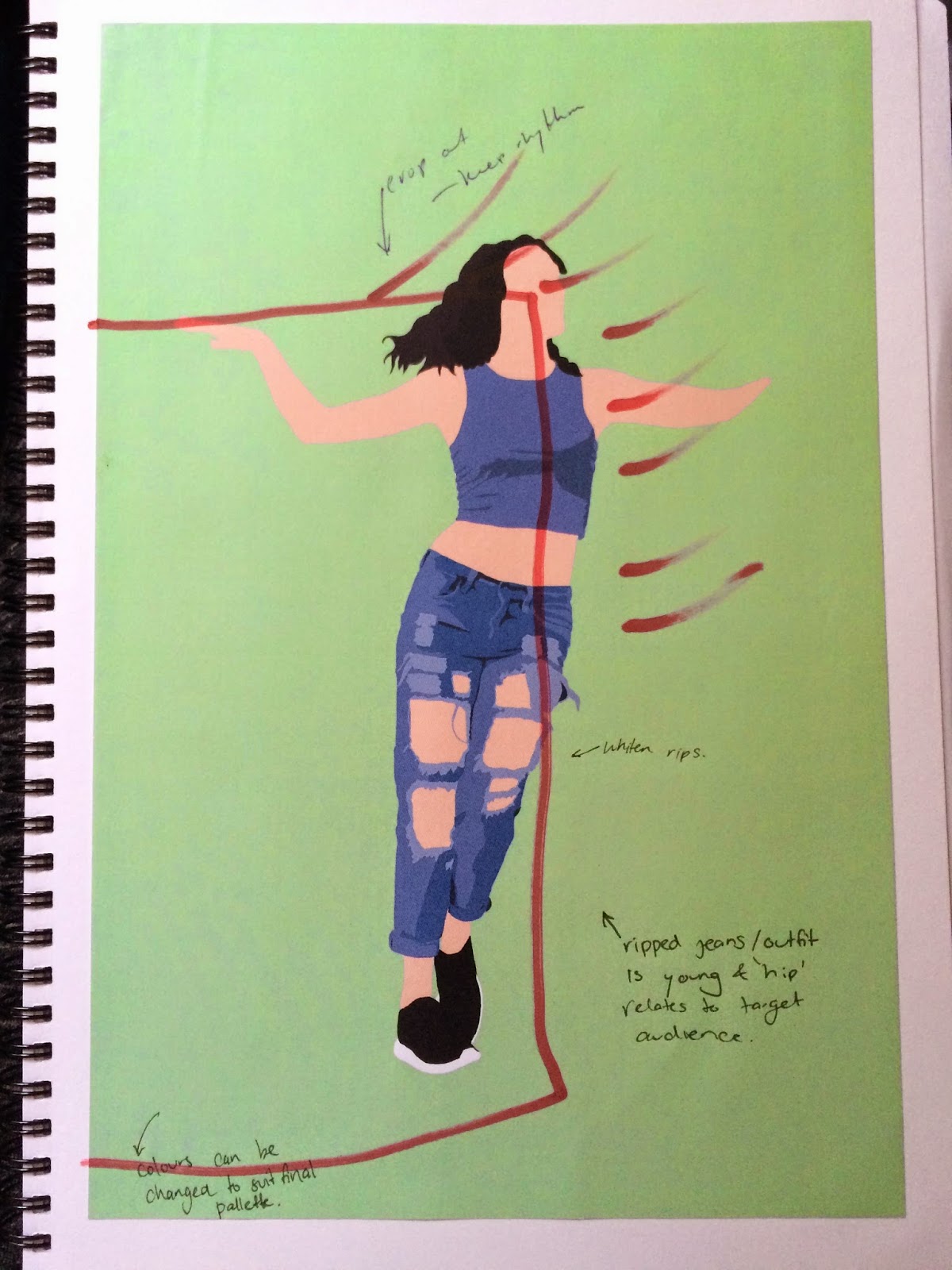
  • crop out face to keep anonymity, makes viewer able to place themselves in the position as the dancer
  • feet and shoes show movement and rhythm
  • ripped jeans narrow audience down


Monday, 9 March 2015

Visual Cues

Week Three

9.3.2015

Todays lecture: Visual Cues-Pattern and Colour

In class we looked at visual cues and patterns, which again gave us a better understanding on how to convey our ideas.

Currently a little stuck on where to go with the project at the moment so made a few more collages with the imagery I created. I have decided to try out a pop art style turing my photographs into paintings on photoshop. They should have a lively, fun feel to them which relates to all my activities. I sketched up some more spread ideas with the digital painting in mind.

Saturday, 7 March 2015

Pattern Brainstorming

Week Two

7.3.15

Today I brainstormed and sketched ideas surrounding each of my locations to potentially create a pattern for my imagery, and also just to generate ideas on what can be on my spread to convey each location.


Friday, 6 March 2015

Sketches & Collage

Week Two

5.3.15

Today i went to the Salsa class on the waterfront and took lots of photos as well as partaking in the class. I got a really good sense of the vibe and the surrounding area so I can generate some visual material.
I also just made some collage/sketches of each activity to start getting the ideas flowing.


Wednesday, 4 March 2015

Visual Language Understanding

Week Two

3.3.2015

In class we went over the formal design elements and the visual language. It was very helpful for beginning the sketching process thinking about my layouts.
We also came up with a lot more adjectives to help describe our destinations to help create a clearer idea on how we can portray the atmosphere of each one.
I have started creating small thumbnail sketches of spreads and also creating collages from found imagery and my own photos/sketches.


Monday, 2 March 2015

Visual Material Inspiration

Week Two

2.3.2015

After class today I went to the library and researched through design books and online for visual material that inspired me. I found a lot of collage and illustrative work that I felt I could bring into my work. Because my theme is 'Cheap Night Entertainments', I feel that my target audience is teens and young adults, especially poor uni students so I need to make the brochure so that it apppeals to them. 
From the visual material I found I have been able to create some quick sketches and experiment with a few ideas.


Sunday, 1 March 2015

Class Critique on Destination Sets

Week Two

2.3.2015

In class we worked in groups and looked at imagery etc we had found from our destinations. I had only been to one of mine so I didnt have much to show but everyone seemed to like my ideas. 
Everyone printed out a few photos(/google images) from each location and we had a class critique. Adrian didnt critique mine but after hearin feedback about others it made me realise how important it is so have set difference between each place whilst also have the 3 point that tie them together.